-
Product Description
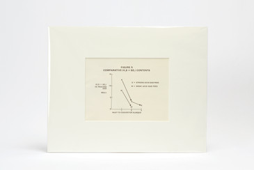
We got our hands on a stash of mid century scientific diagrams from the archives of the Griffith Observatory, Los Angeles. Figure 6, pictured here, charts "Comparative Water Vapor Contents" Don't ask us to explain what on earth that means (something to do with comparing sulfur dioxide and hydrogen sulfide), but we sure think it makes for a neat print.
-
Product Reviews
-
Find Similar Products by Category